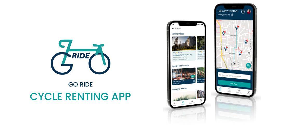
Go Ride brings cycle rentals, route discovery, and community rides – All in one app.
Users get quick access to bikes. The business improves asset usage and reduces manual operations.
Design
Process Used
The Double Diamond framework was used to manage uncertainty across user behavior, habit formation, and business retention risk.
The problem space was broad, with multiple user types. This approach helped separate real issues from assumptions before design decisions.
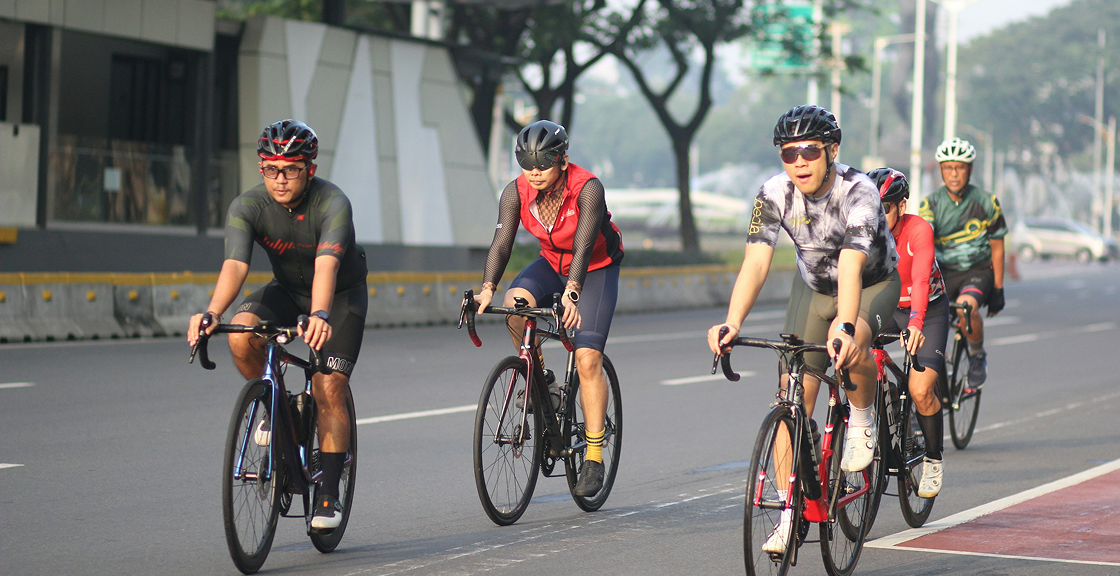
Users struggled to find available cycles and understand pricing before arrival. Operators relied on manual tracking, leading to wrong availability and disputes. Users lost trust due to failed pickups and unclear rules. For the business, this caused cancellations, support overload, and lost revenue.
The core problem was unreliable access to cycle rentals at the moment of need. Target users were daily commuters, tourists, and short-distance urban riders. The key pain point was uncertainty—availability, pricing, and pickup flow.
The design focused on clarity, speed, and trust over visual complexity. Rules were set: no hidden steps, no unclear pricing, no manual confirmation loops.
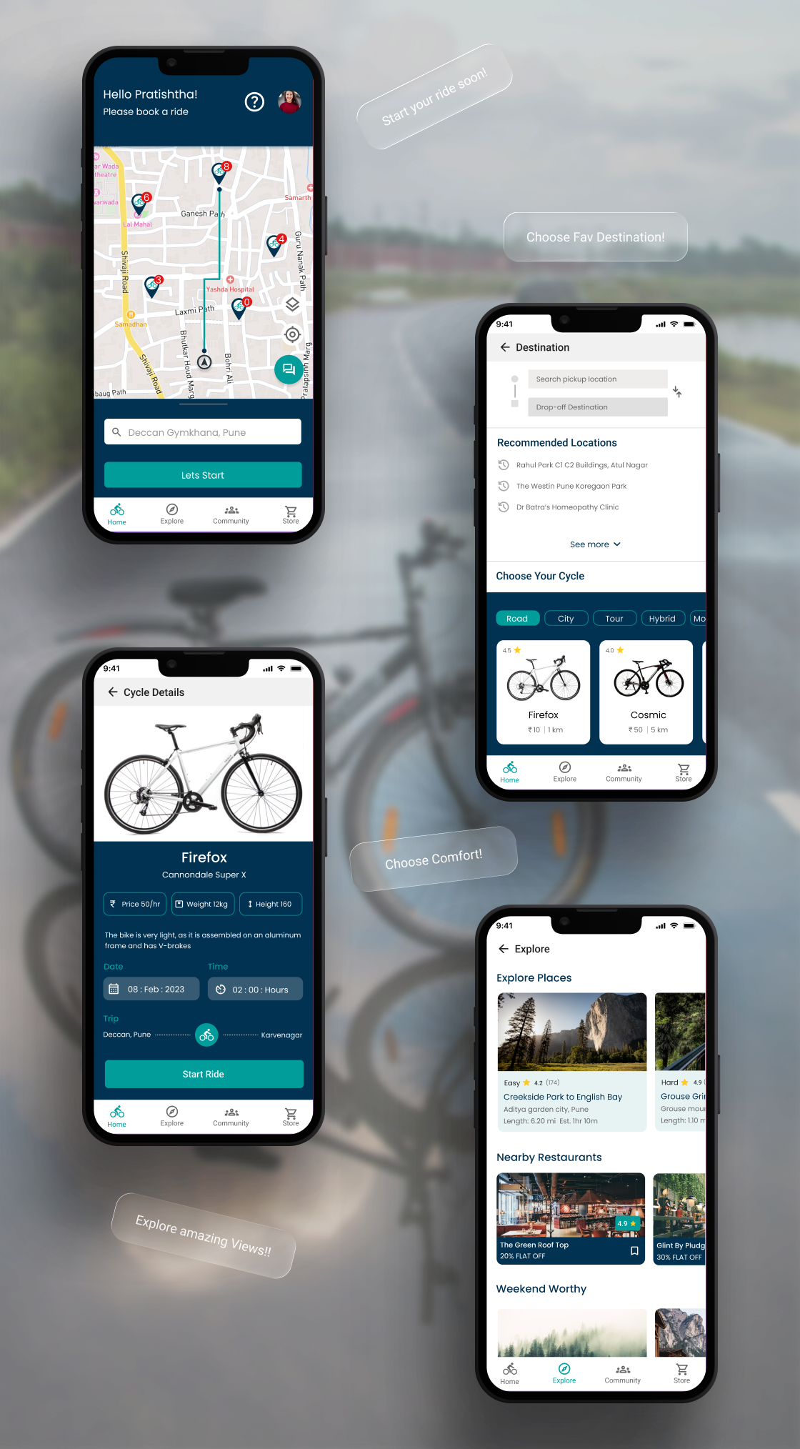
A mobile app was designed to show real-time cycle availability and fixed booking flows. Users could locate, reserve, unlock, and return cycles without staff involvement. Operators gained a single system for inventory, bookings, and usage tracking.
LOGO DESIGN
Every logo starts with understanding before aesthetics. We begin by defining the brand's purpose and context, explore visual directions through sketching and iteration, and refine the mark through geometry, balance, and usability testing. The final logo is crafted to work seamlessly across screens, sizes, and real-world use.
IDEATION
Multiple ideas were explored, including subscription models and gamification. These were dropped due to low business readiness and high tech effort. The final solution focused on core renting, not feature overload.
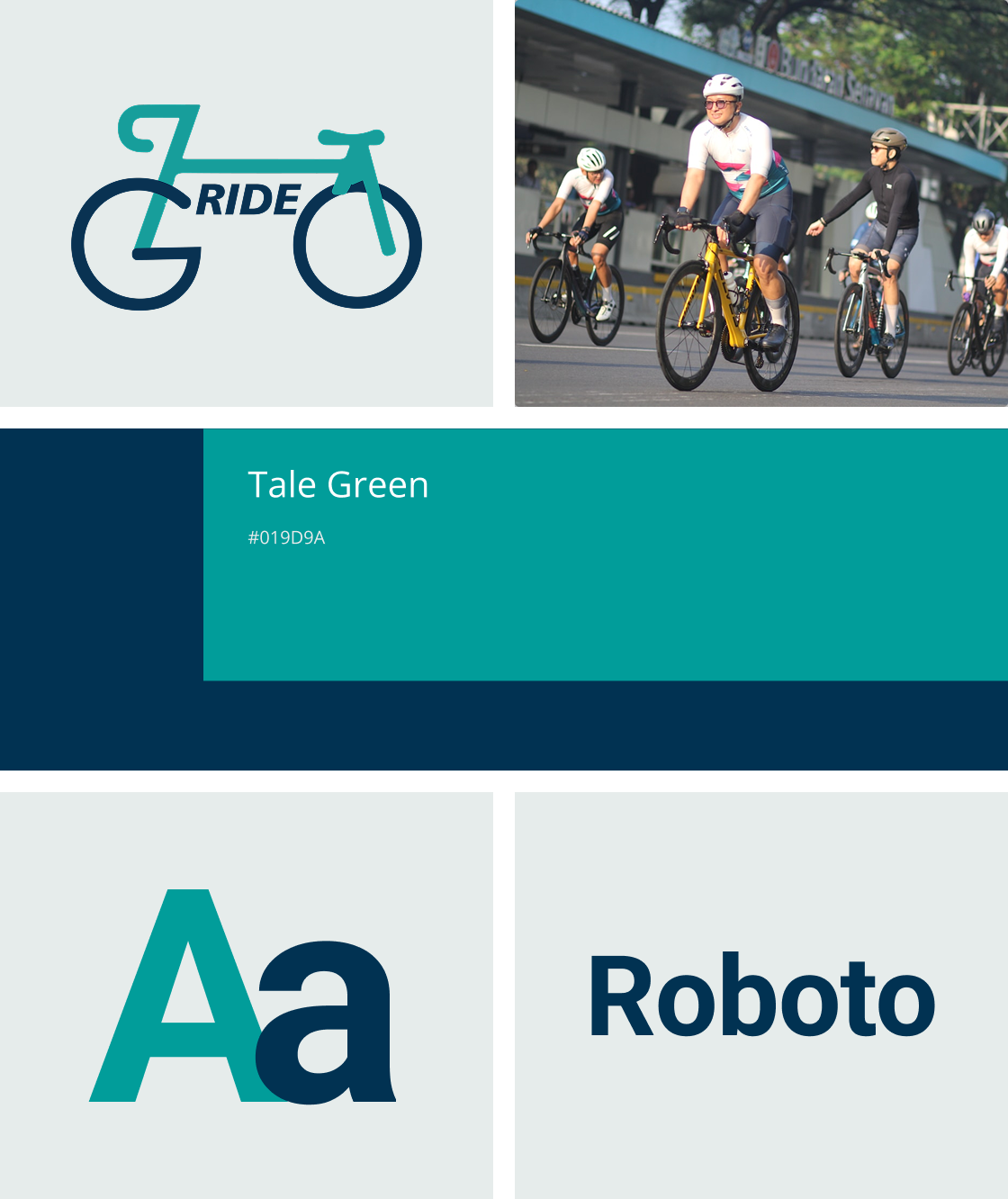
DESIGN SYSTEM
The Go Ride design system was built to ensure clarity, consistency, and ease of use across the product. It defines typography, colour, components, and interactions that scale seamlessly while keeping the experience intuitive and accessible.
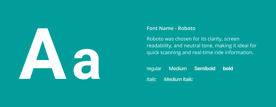
Typography
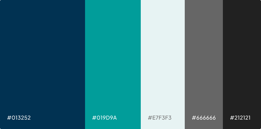
Color
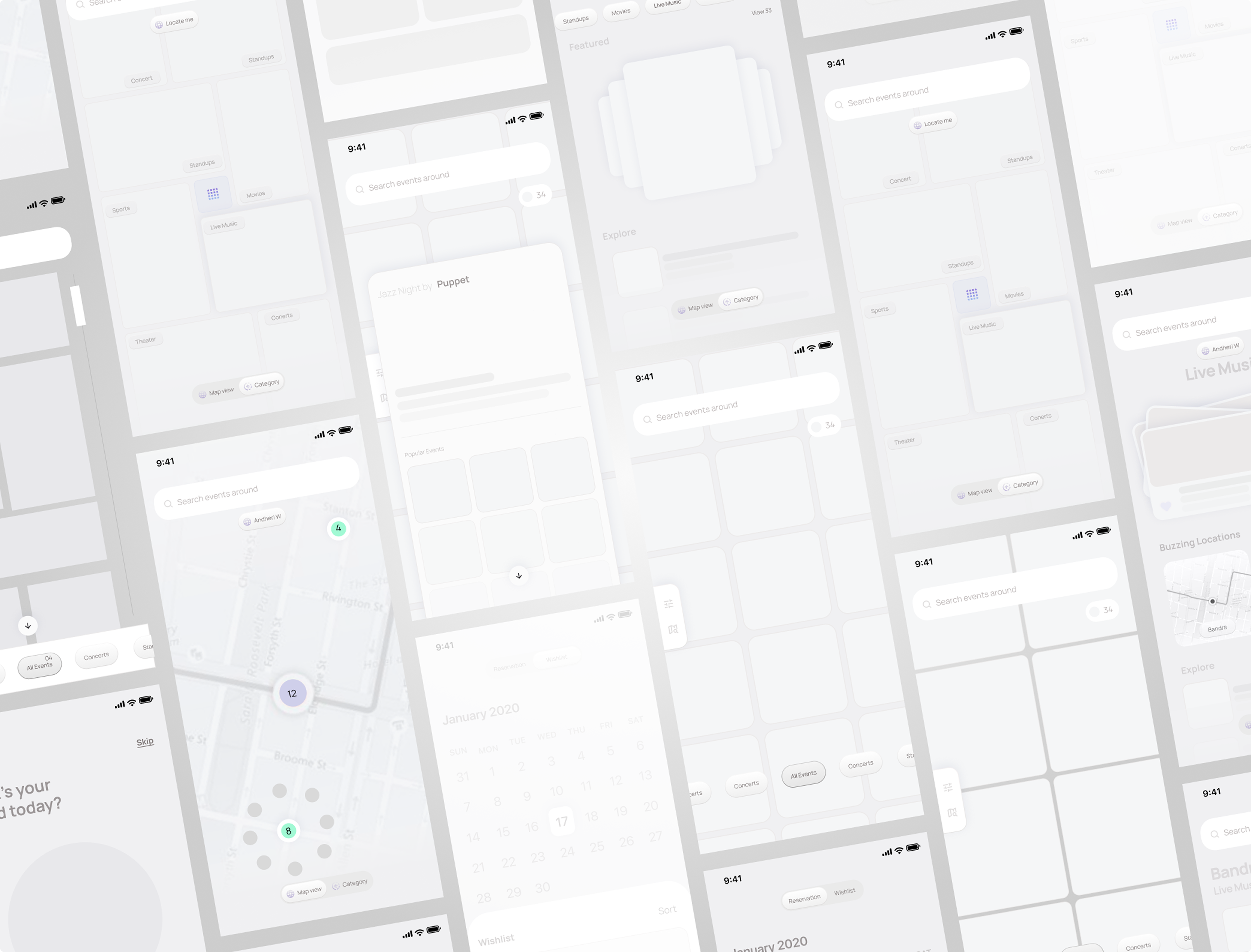
VISUALS
Instead of designing another feed or card layout, we envisioned Scenes as a navigable world, one where event discovery becomes simpler and distinctly interactive.
Our Role
Our responsibility covered user research, Branding strategy, UX architecture, Design systems, Interaction Design and UI execution.
UX Strategy
Market Research
Emerging Trends
UX research
Brand Experience
Branding Strategy & Positioning
Illustration & Iconography
Product Design
User Experience Design
Interface Design
Interaction Design
Design Systems
Prototyping and usability testing
CONCLUSION
This project solved a real access and operations problem, not just a UI issue. It connected user trust directly to business efficiency. The system is scalable across cities and fleet sizes.
What Our Clients
Say
AQAS
“We came in with a lot of ideas but no clear direction. The Nimora team helped us slow down, ask the right questions, and make decisions we felt confident standing behind.”
Syed Zeeshan Hussain Naqvi
CEO - SaaS

Get clarity before you build
Whether you’re shaping an idea, refining a product, or planning what’s next we’ll help you make sense of the mess and decide the right way forward.
Get product clarity