A focused time-management platform that plan, prioritise, and execute academic work without cognitive overload.
Delivers structured planning that reduces student decision fatigue and missed deadlines, while driving higher retention and engagement for education platforms through consistent, outcome-driven usage.
Design
Process Used
The Double Diamond framework was used to manage uncertainty across user behavior, habit formation, and business retention risk. This approach allowed the team to separate assumptions from evidence, align product decisions with business outcomes, and reduce the risk of building features that looked useful but failed in real-world student routines.

Students frequently created schedules but abandoned them within days. Students tracked tasks but struggled to decide what to do next. Students used multiple disconnected tools (notes app, calendar, reminders). Most competing apps optimised for professionals, not academic workflows.
Students don't fail to plan—they fail to sustain execution because planning systems demand too many decisions upfront. Cognitive overload caused by unclear priorities and unrealistic schedules.
The product shifted from being a task container to a decision-reducing system. The interface priorities “what matters now” over showing everything at once. Students receive default frameworks before customisation options.
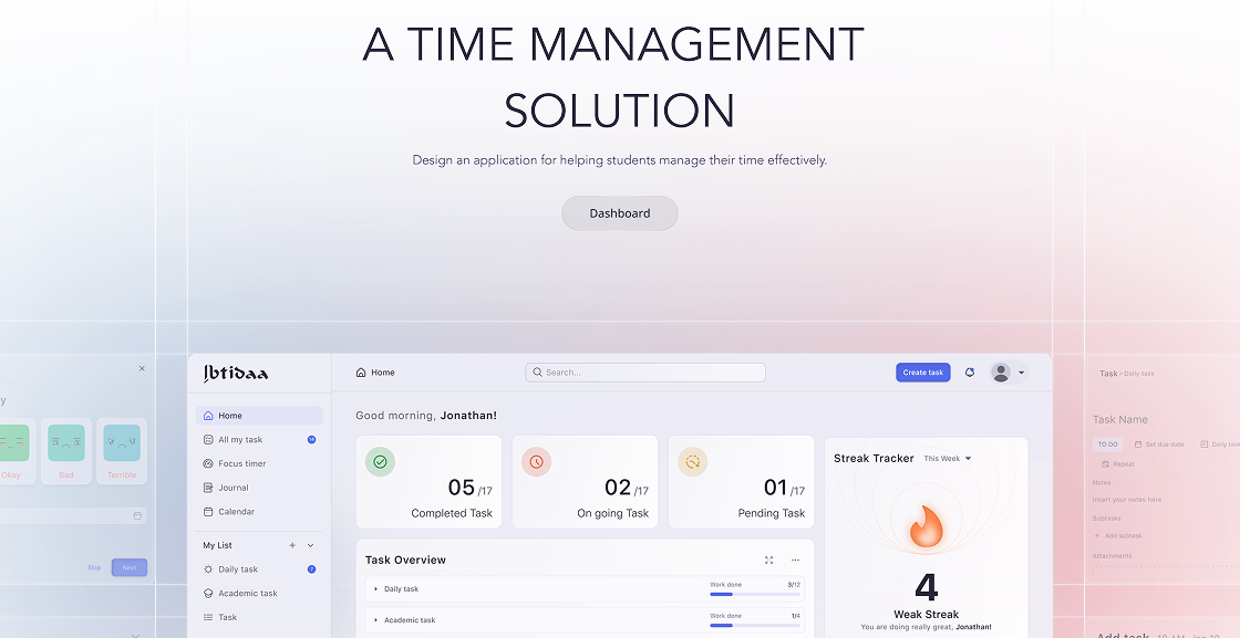
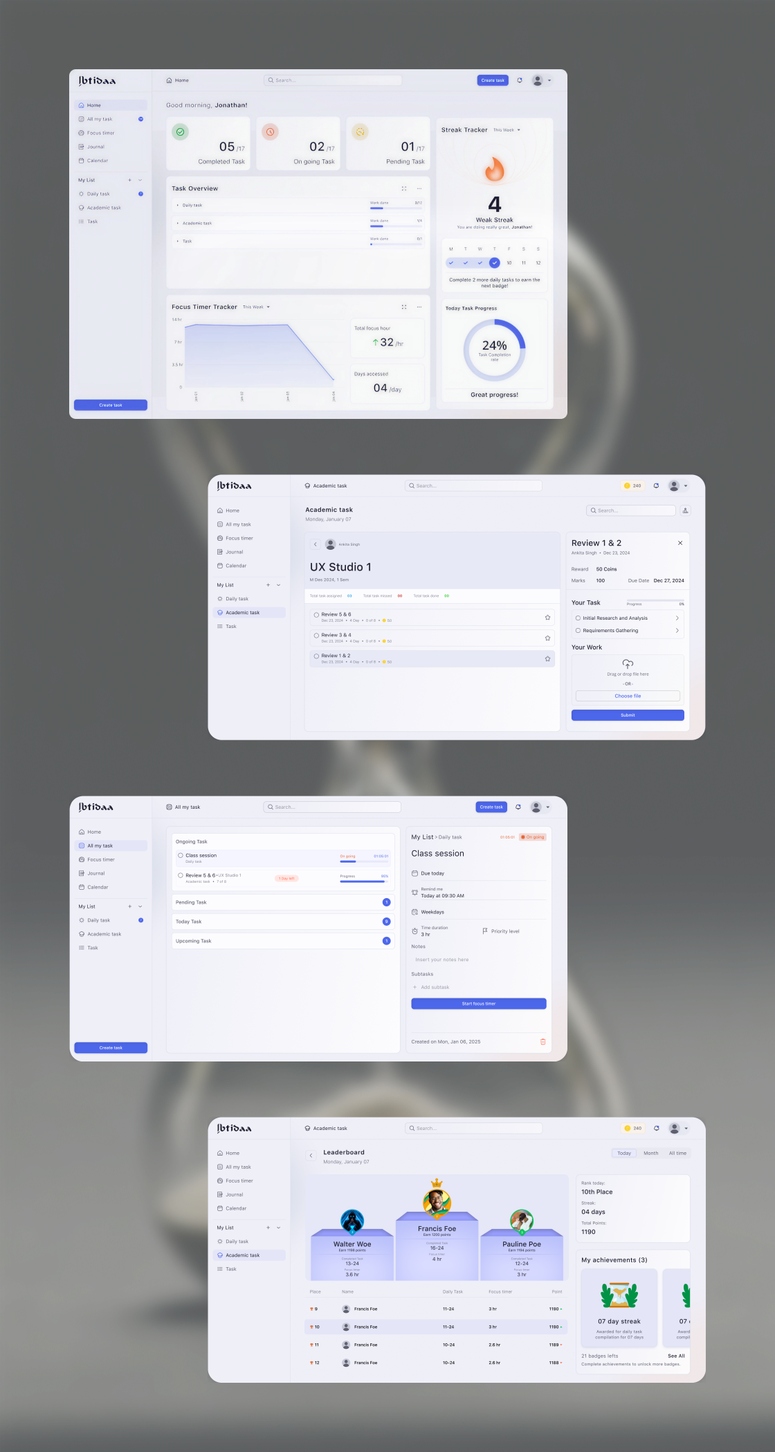
A guided academic planning system combining:
- Task input with automatic time-slot suggestions
- Daily priority limits to prevent overload
- Visual separation between “must-do” and “optional” tasks
How It Solves the Problem
- Converts vague intentions into executable plans
- Reduces daily planning effort
- Encourages consistent engagement through achievable workloads
Why This Solution Was Chosen
Alternative concepts (gamification, social accountability, streaks) were deprioritized because they increased engagement without solving execution failure.
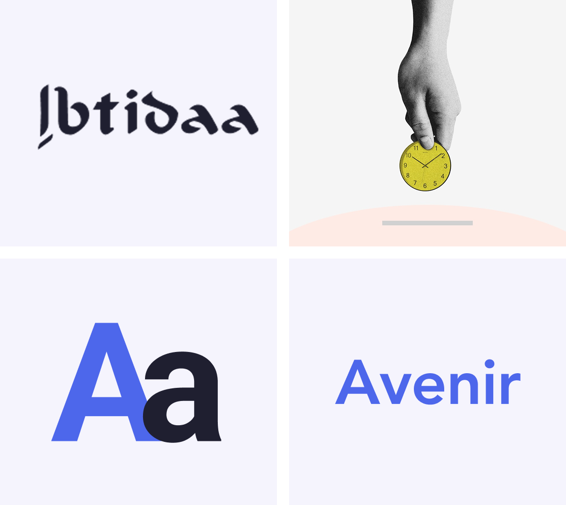
BRANDING
Every logo starts with understanding before aesthetics. We begin by defining the brand's purpose and context, explore visual directions through sketching and iteration, and refine the mark through geometry, balance, and usability testing. The final logo is crafted to work seamlessly across screens, sizes, and real-world use.
IDEATION
The team looked at AI schedules, group features, and rewards, but didn't use them because they were hard to trust and added confusion. Instead, the focus stayed on one clear workflow using simple logic that works reliably.
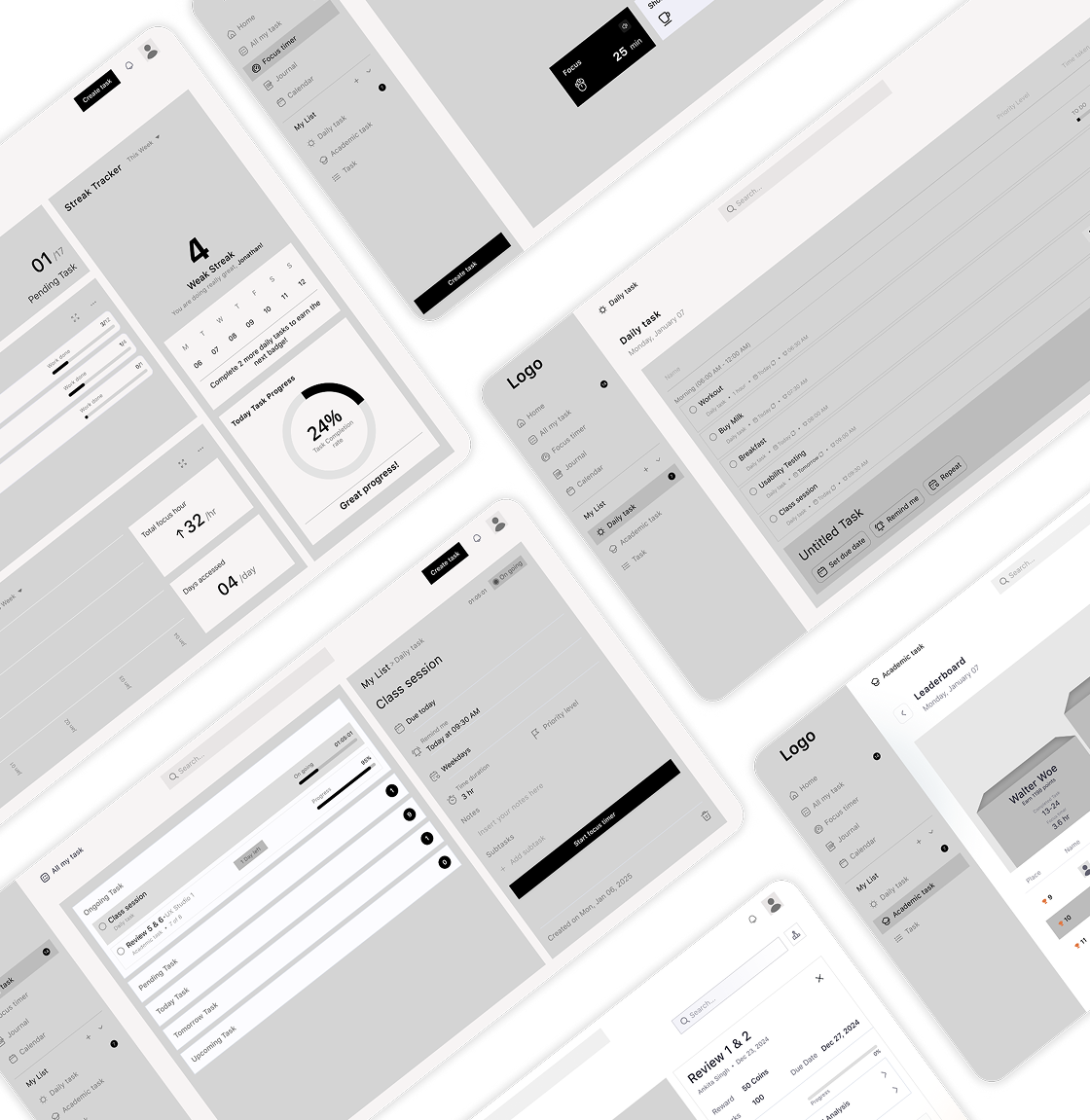
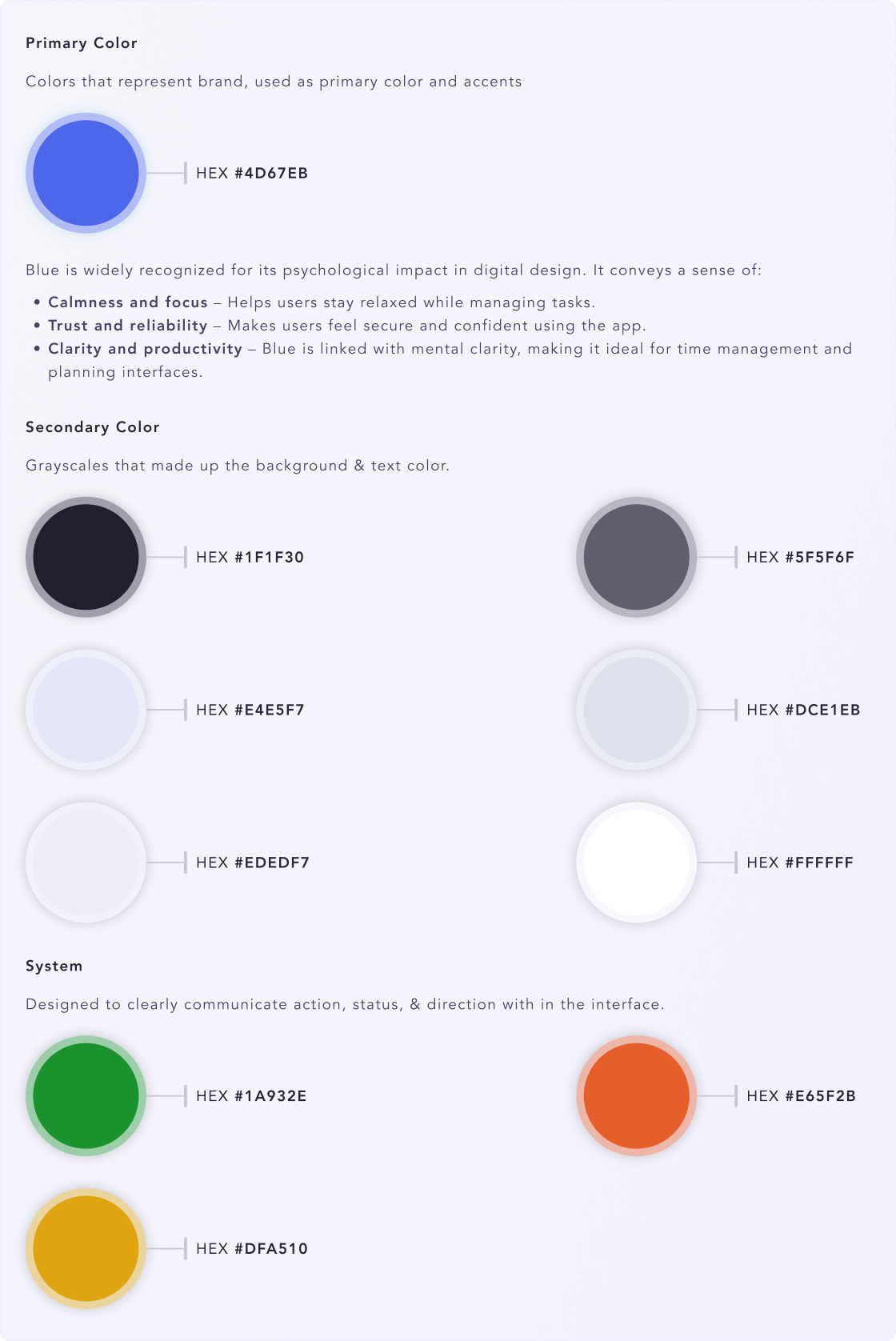
DESIGN SYSTEM
The design system keeps layouts, colours, and components consistent across the dashboard. It helps teams build faster while keeping the experience clear and easy to use.
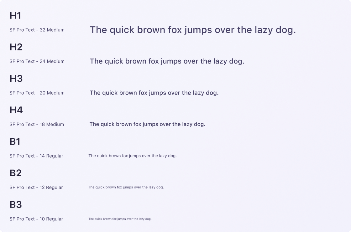
Typography
Color
VISUALS
The visuals are clean and minimal to help users focus on tasks and time blocks. Clear spacing and soft colors reduce stress and make schedules easy to scan.
Our Role
We led the UX strategy and product design, shaping the core workflow and structure. We aligned user needs with business goals to deliver a clear, scalable solution.
UX Strategy
Business Goals
Emerging Trends
User needs
Brand Experience
Illustration & Iconography
Branding Strategy & Positioning
Product Design
User Experience Design
Interface Design
Design System
Interaction Design
Prototyping and usability testing
Iterative Testing
CONCLUSION
This project focused on helping users actually complete tasks, not just look productive. It solved a real problem by keeping the system easy to use and reliable. The solution is built to scale, with room to grow through smarter features and partnerships.
What Our Clients
Say
AQAS
“We came in with a lot of ideas but no clear direction. The Nimora team helped us slow down, ask the right questions, and make decisions we felt confident standing behind.”
Syed Zeeshan Hussain Naqvi
CEO - SaaS

Get clarity before you build
Whether you’re shaping an idea, refining a product, or planning what’s next we’ll help you make sense of the mess and decide the right way forward.
Get product clarity